01The opening
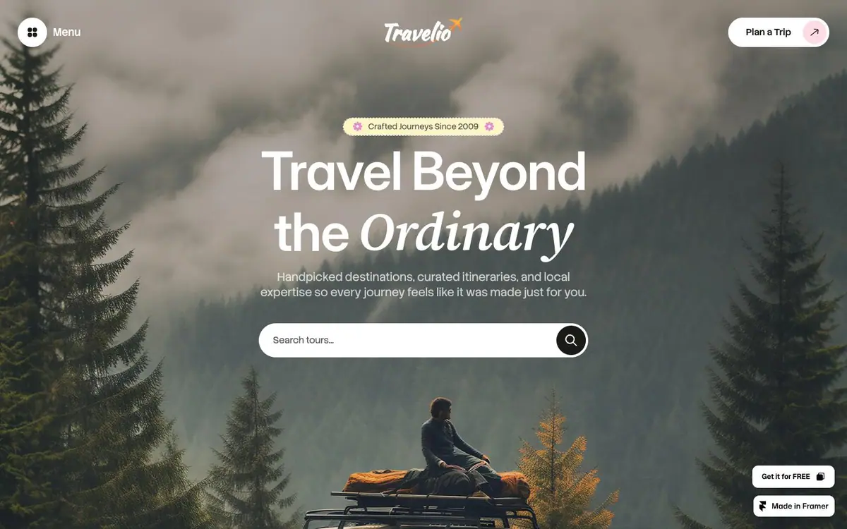
Misty forest, every control a pill, and a white search field with a round button.
The two layouts carry the same amount of reading.
01The opening
Measured 2026-09-01
The site, read one section at a time. What each one is for, and the one thing the design does there.
01The opening
Misty forest, every control a pill, and a white search field with a round button.
02Three kinds of journey
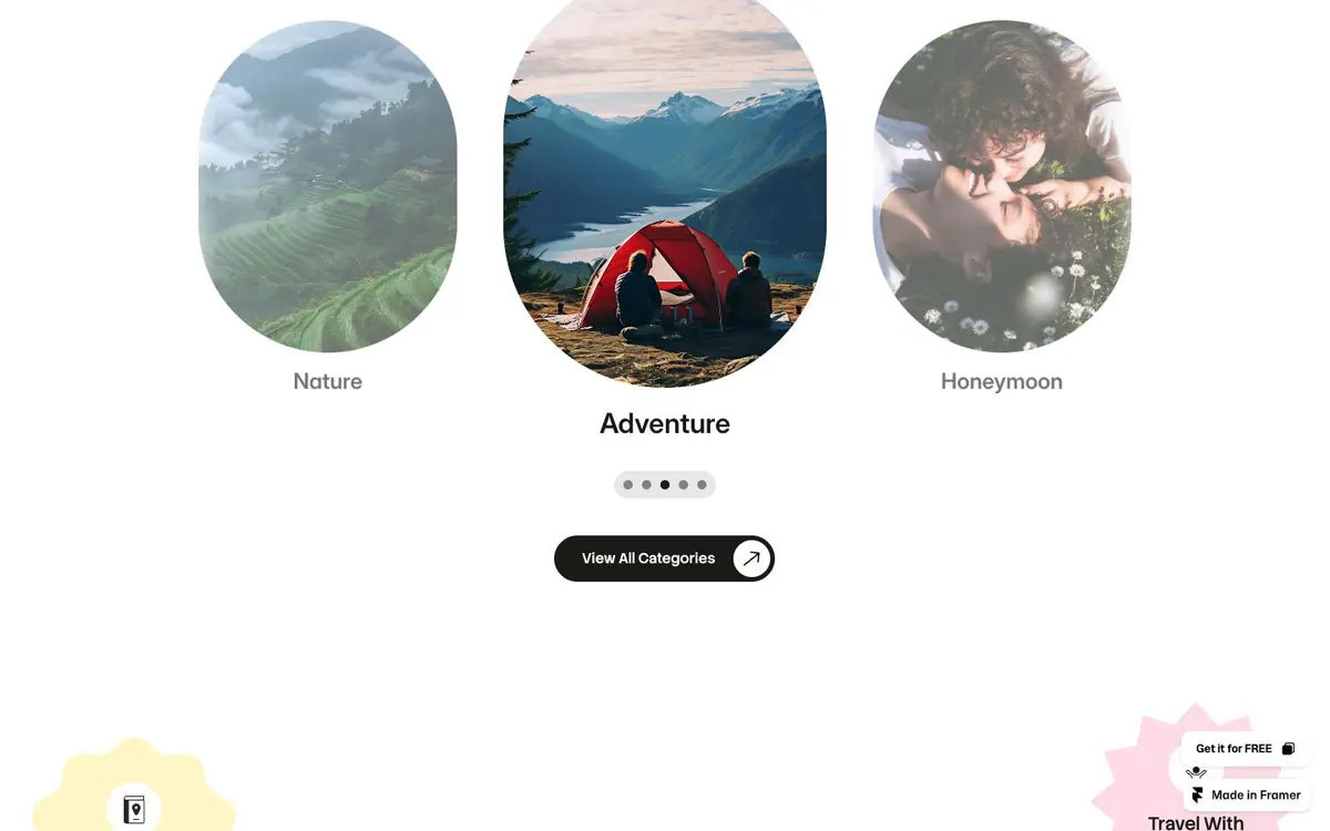
Three circular photographs, the middle one larger and lifted, with torn paper at the corners.
03Featured tours
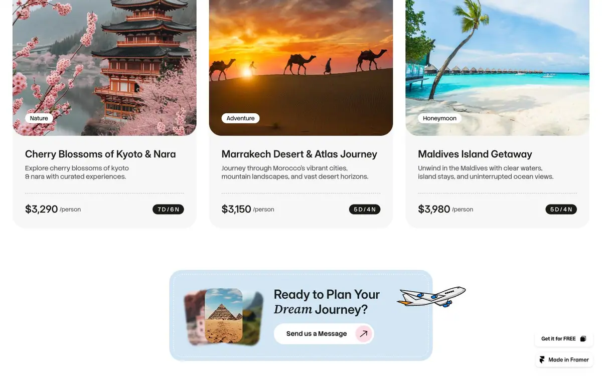
Three cards, a category chip over each photograph, the price the only bold type in the row.
04The destination carousel
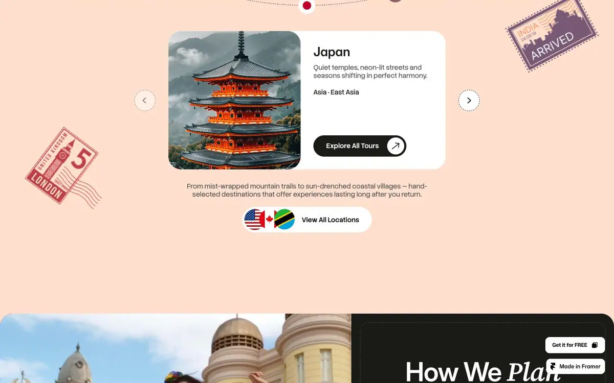
A destination card on pink with round arrows either side and postage stamps stuck around it.
05Reviews
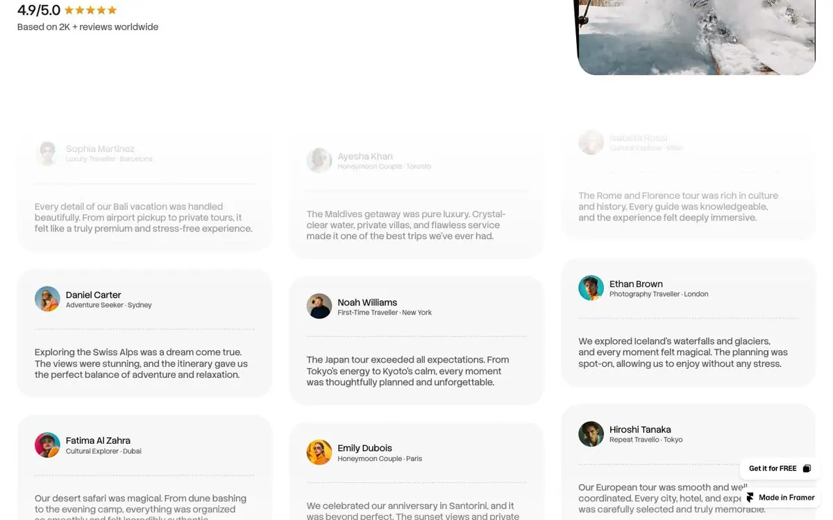
A masonry of testimonial cards, three columns, uneven heights, the top and bottom rows faded out.
06Closing
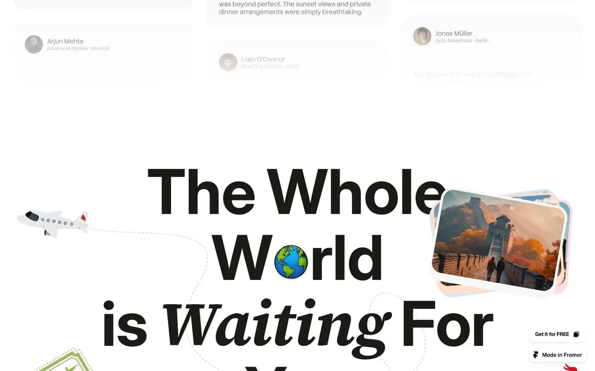
A headline over four lines, roman and italic mixed, a paper plane cutting through it.
Every colour was read off the rendered page and weighted by the area it paints. Photographs are not in it.
The same page at 1440, 834 and 390 pixels wide, drawn at one scale so the phone really is this much narrower.


