01The opening

Dark nav, a three-line headline with its last clause in orange, a browser mockup beside it.
The phone stacks into 1.2 times the scroll rather than shrinking the desktop layout.
01The opening
Measured 2026-09-01
The site, read one section at a time. What each one is for, and the one thing the design does there.
01The opening
Dark nav, a three-line headline with its last clause in orange, a browser mockup beside it.
02The empty-diary calculator

Two labelled sliders on a dark panel, and the figure they produce set very large in orange.
03The line that carries the argument

One sentence in two centred lines, one word in orange. No photograph, no button, one screenful.
04Numbers, and a client's words
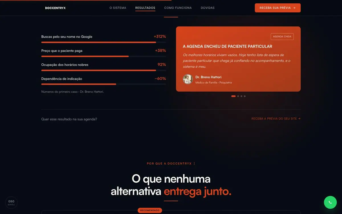
Four labelled bars with percentages left, and the section's one solid orange card, a quote, right.
05The comparison table
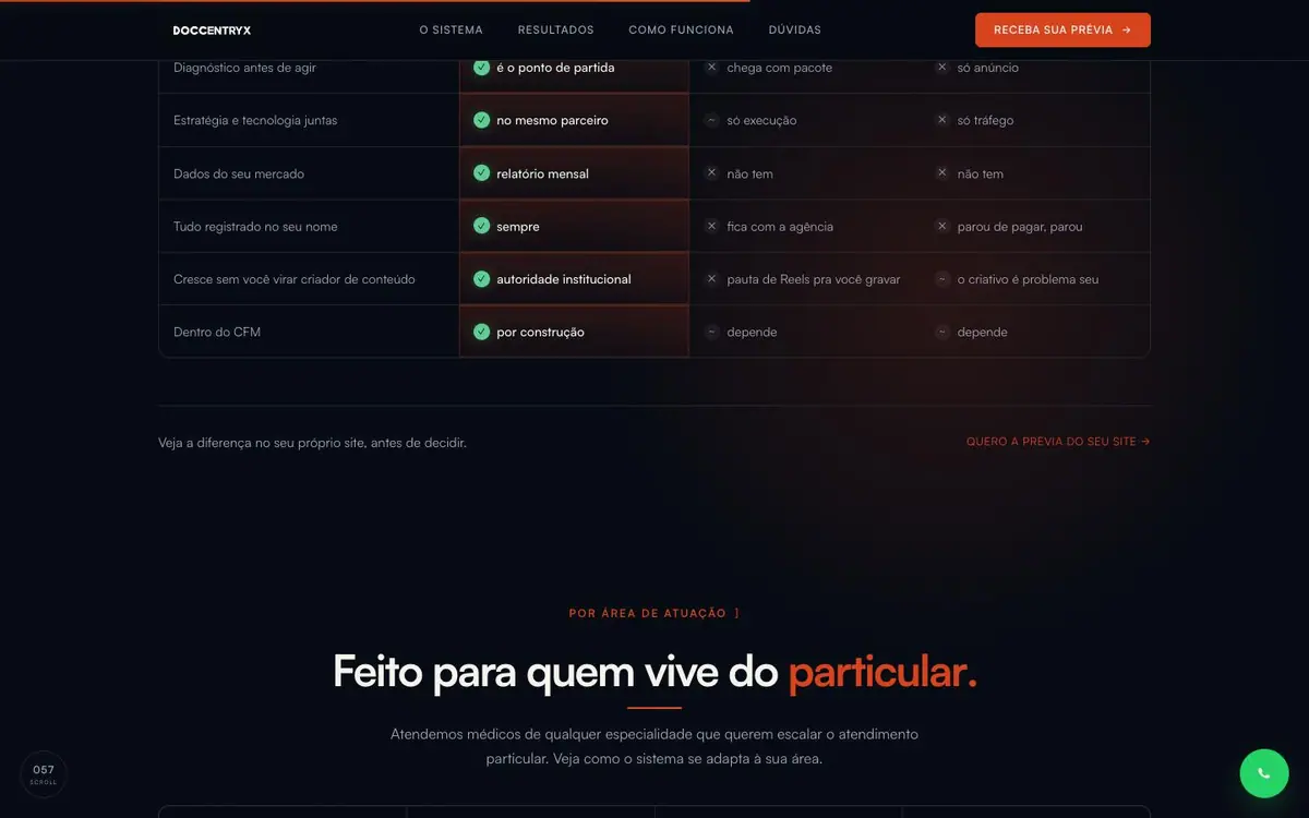
Four columns, the second highlighted in orange red, ticks and short phrases in every cell.
06The thirty-second quiz
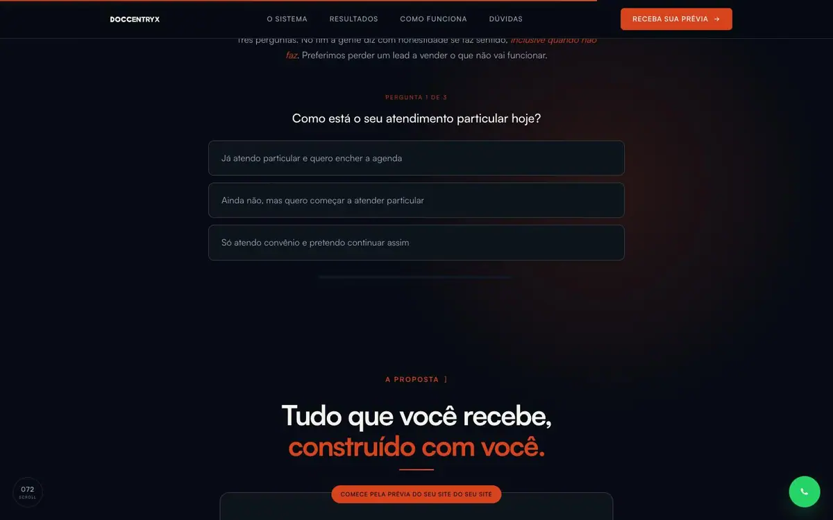
One question centred, three full width answer buttons under it, and nothing else on the screen.
Every colour was read off the rendered page and weighted by the area it paints. Photographs are not in it.
The same page at 1440, 834 and 390 pixels wide, drawn at one scale so the phone really is this much narrower.


