01The opening
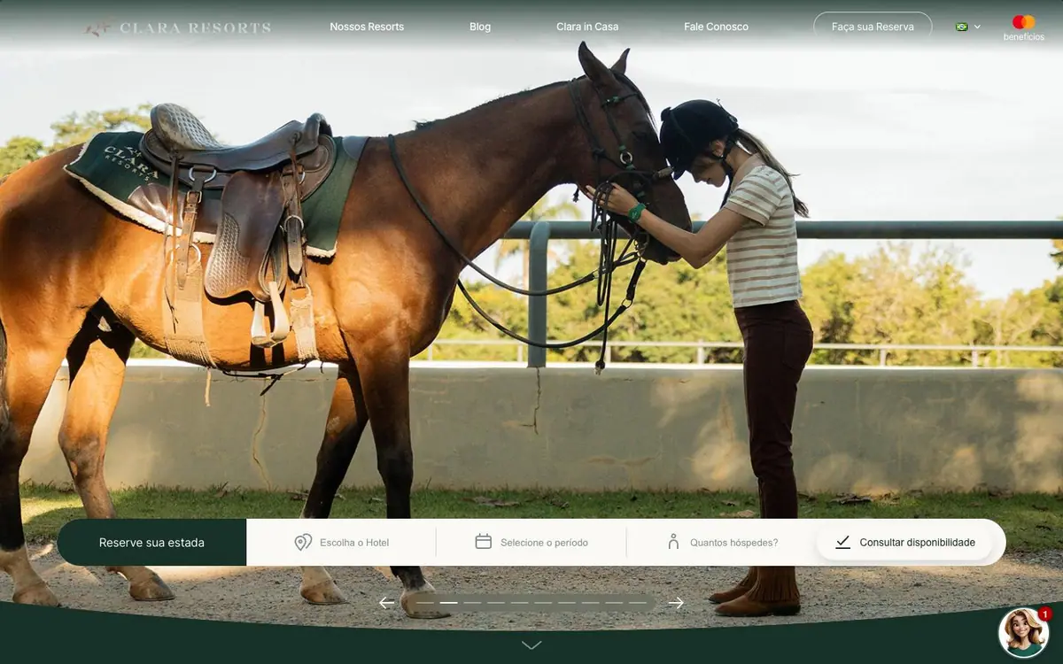
One photograph, one white booking bar, one green button. Nothing else on the screen asks to be touched.
The phone stacks into 1.2 times the scroll rather than shrinking the desktop layout.
01The opening
Measured 2026-09-01
The site, read one section at a time. What each one is for, and the one thing the design does there.
01The opening
One photograph, one white booking bar, one green button. Nothing else on the screen asks to be touched.
02The concept
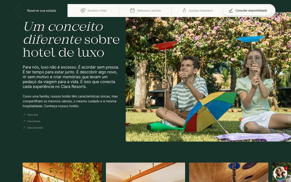
Dark green ground, a serif italic headline, three photographs. The text argues and the pictures carry the feeling.
03The three houses
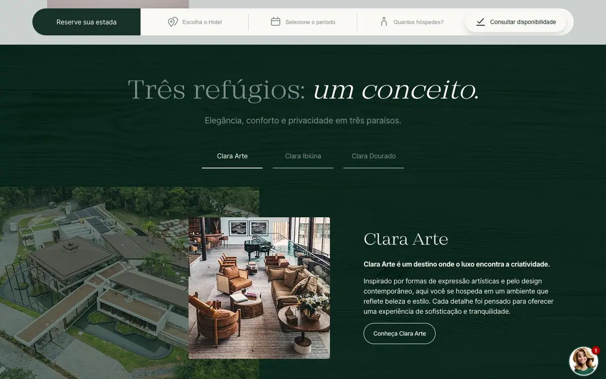
Three tabs, one photograph at a time, one outline button. Three properties read as one family.
04Gastronomy
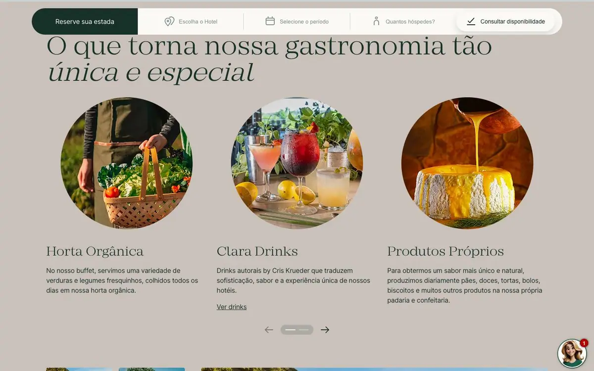
Three round photographs with captions, the site's one break from rectangles. They mark the section.
05Guests and awards
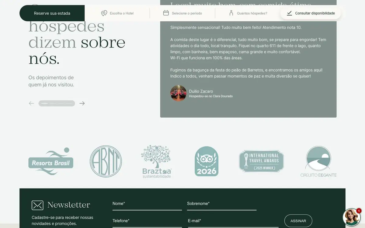
One guest's words in a grey panel, then six logos in green. A voice first, then the badges.
06Newsletter and footer
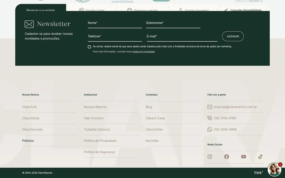
Four fields and one button on the green the page opened with. The site closes where it began.
Every colour was read off the rendered page and weighted by the area it paints. Photographs are not in it.
The same page at 1440, 834 and 390 pixels wide, drawn at one scale so the phone really is this much narrower.


