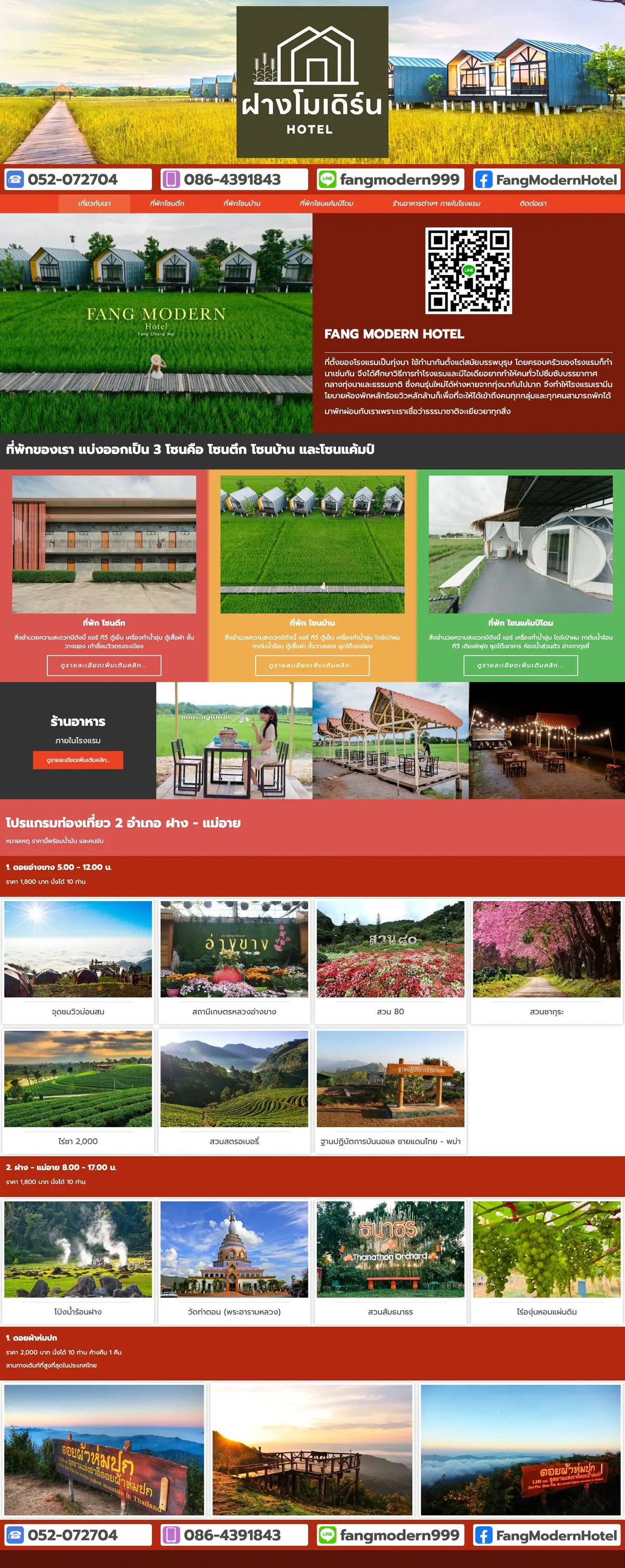
01The opening
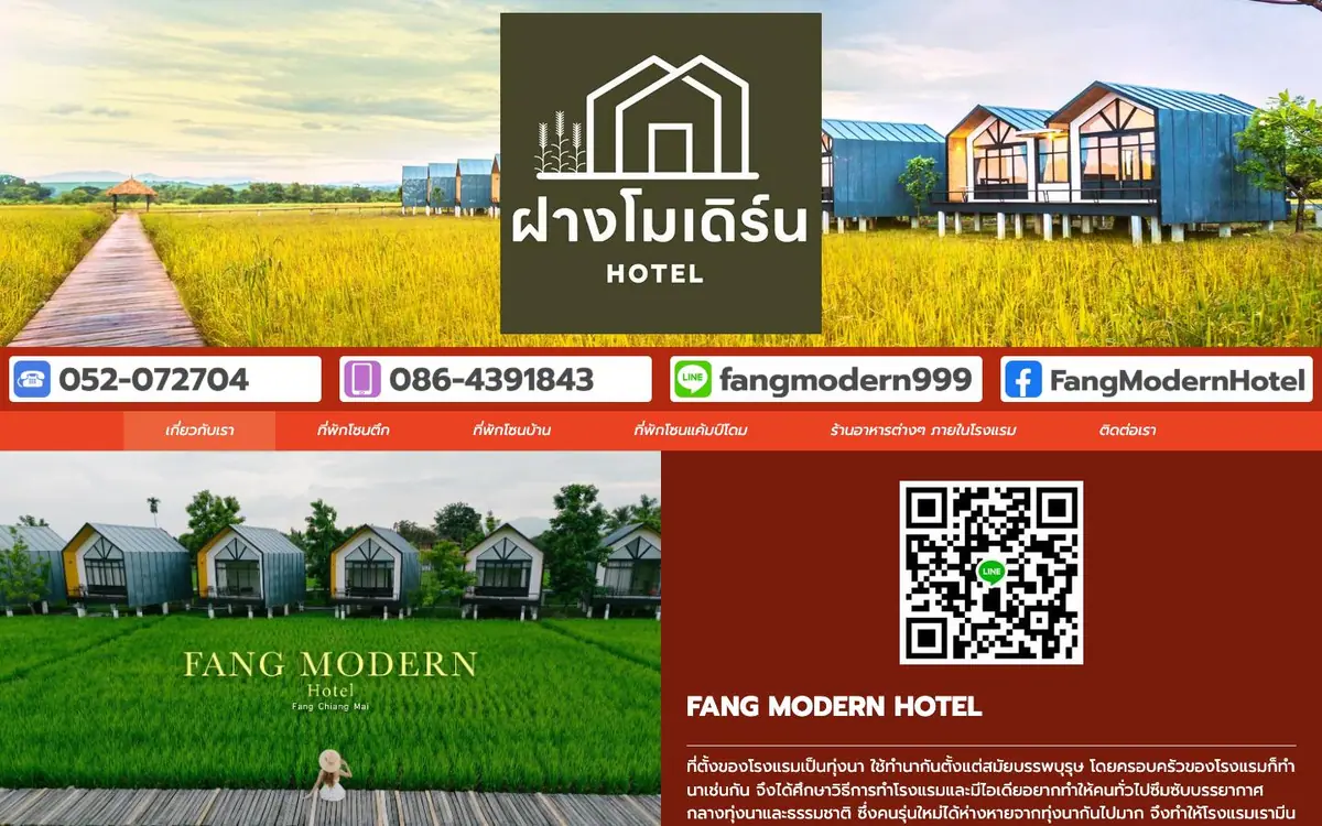
A logo badge over the cabins, four coloured contact chips, a red Thai nav under them.
The phone stacks into 2.6 times the scroll rather than shrinking the desktop layout.
01The opening
Measured 2026-09-01
The site, read one section at a time. What each one is for, and the one thing the design does there.
01The opening
A logo badge over the cabins, four coloured contact chips, a red Thai nav under them.
02The three zones
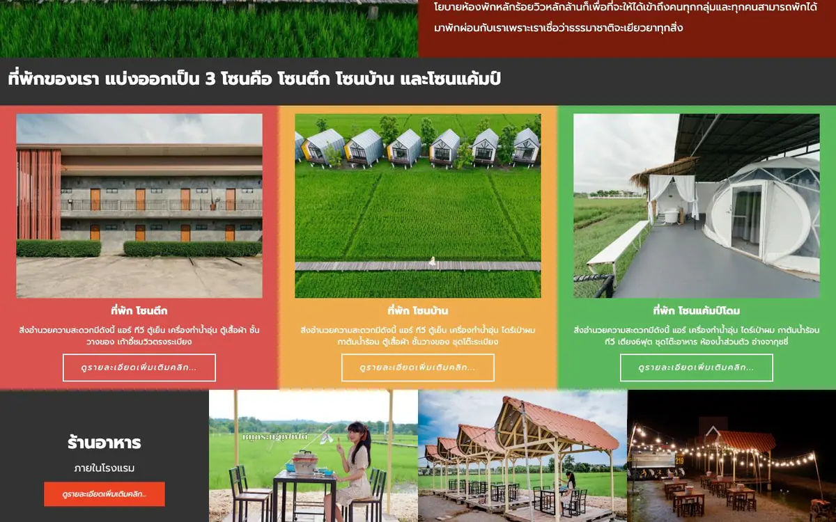
Three cards, each on its own coloured block, red then green then pale green, one button each.
03The tour programme
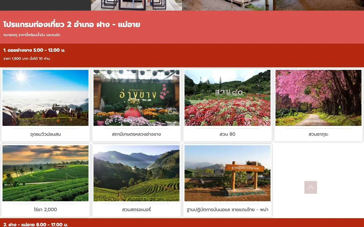
A red block of times and prices, then eight captioned photographs edge to edge, no gutters.
04Places and prices
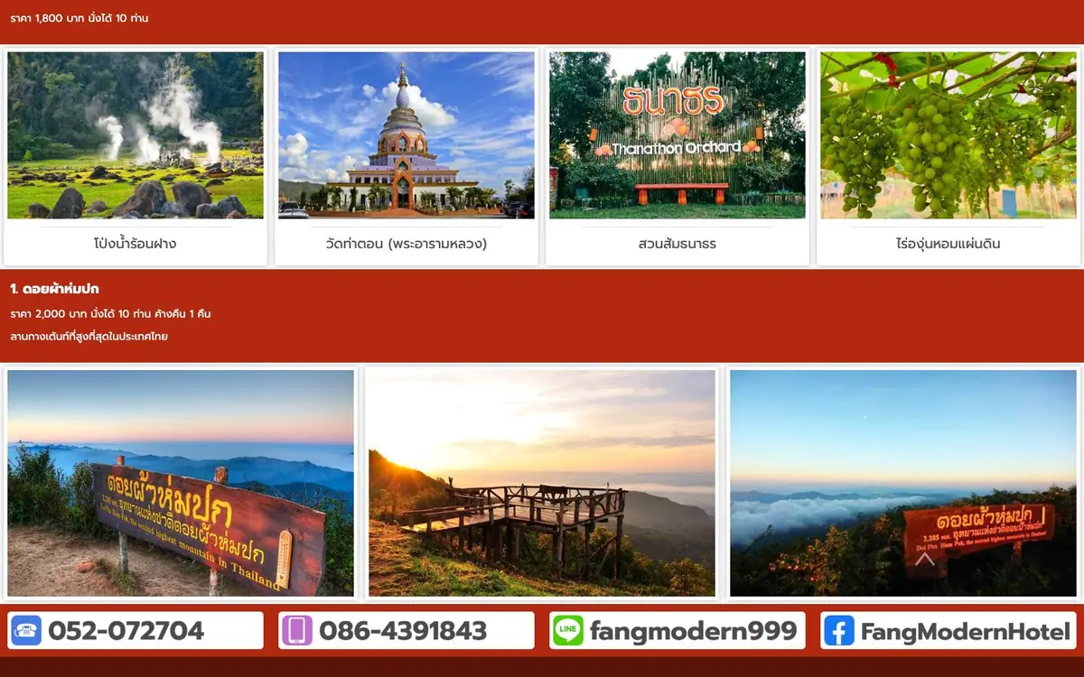
Four more photographs, a red price block, three viewpoints, and the contact chips repeated in order.
Every colour was read off the rendered page and weighted by the area it paints. Photographs are not in it.
The same page at 1440, 834 and 390 pixels wide, drawn at one scale so the phone really is this much narrower.