01The opening
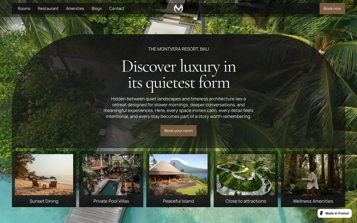
Dark palms, the logotype centred, one amber button, and five captioned thumbnails along the bottom edge.
The phone stacks into 1.6 times the scroll rather than shrinking the desktop layout.
01The opening
Measured 2026-09-01
The site, read one section at a time. What each one is for, and the one thing the design does there.
01The opening
Dark palms, the logotype centred, one amber button, and five captioned thumbnails along the bottom edge.
02Restaurant
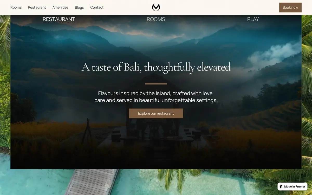
Three words spaced across a dusk photograph as their own menu, the type in its darkest part.
03Guest stories
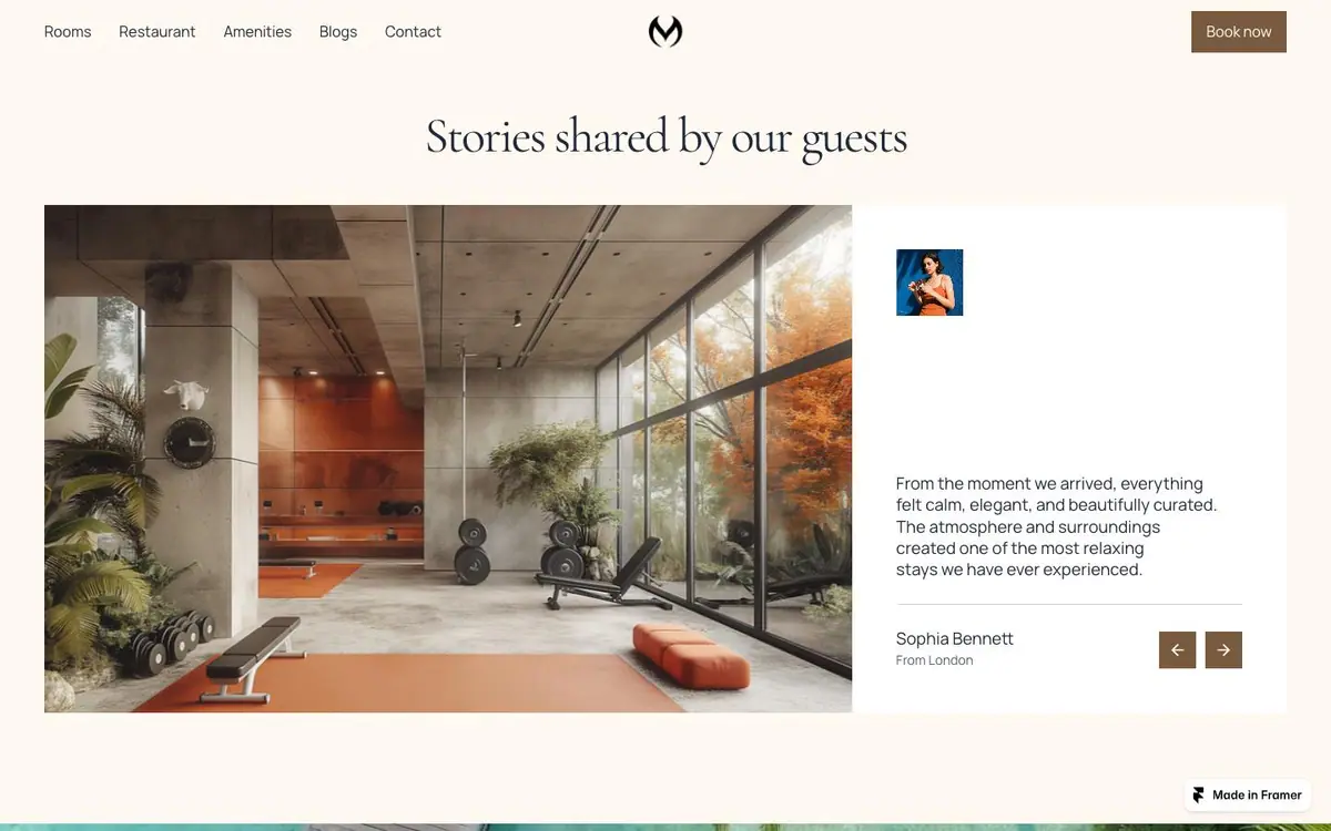
Cream, the first break from photography: the room on the left, one guest's words on the right.
04Spaces and amenities
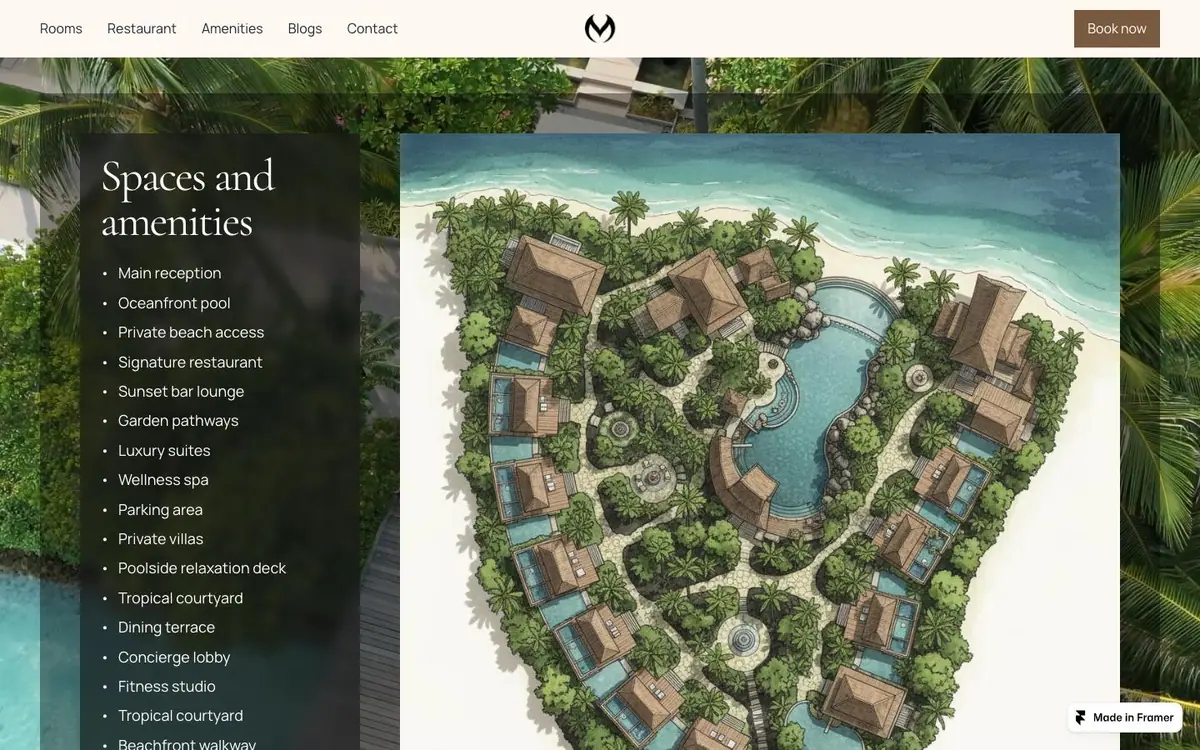
Eighteen amenities as a plain list, and beside it the resort drawn rather than photographed.
05Journal
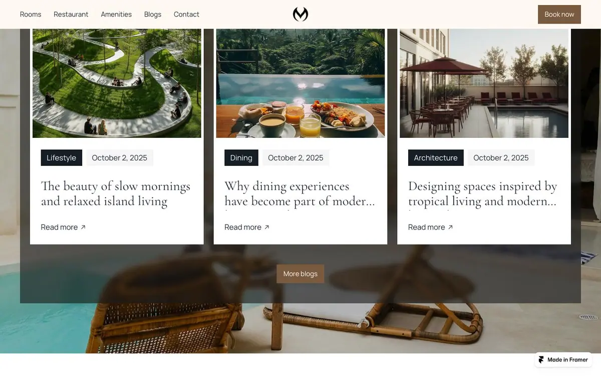
Three cards of equal width, a category chip and a date over each photograph.
06Closing and footer
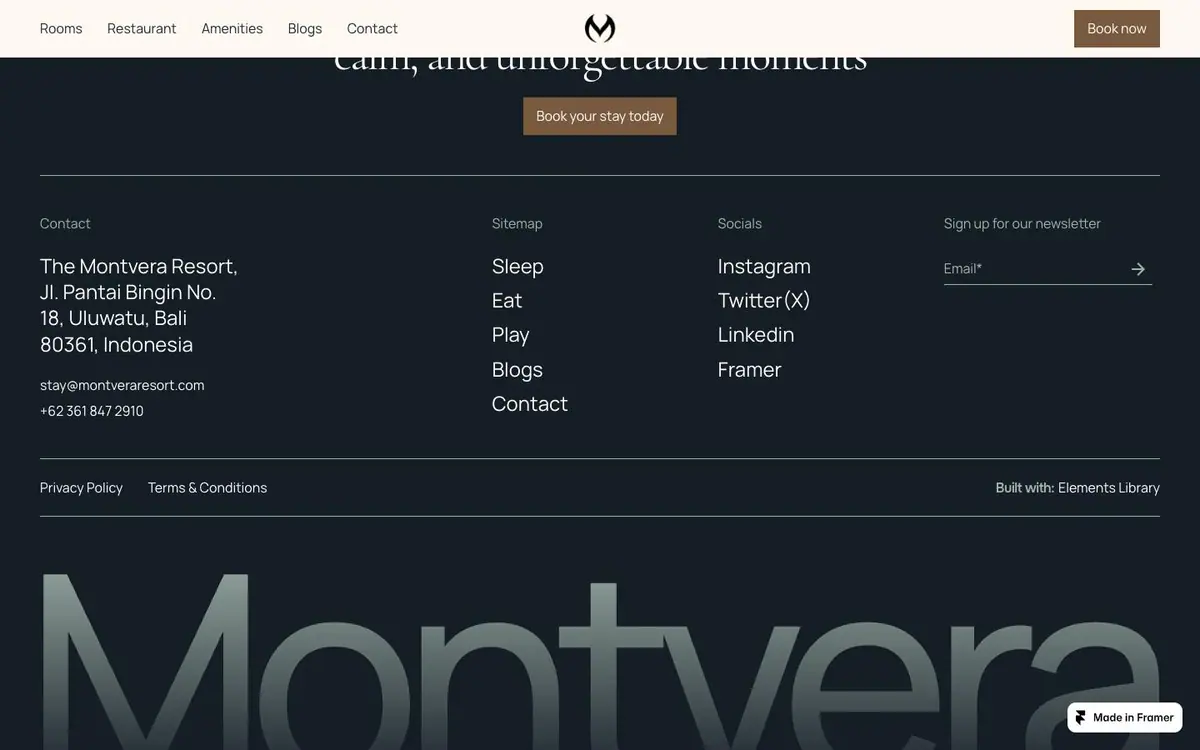
Dark ground, four footer columns, and the word Montvera set enormous and cut by the page edge.
Every colour was read off the rendered page and weighted by the area it paints. Photographs are not in it.
The same page at 1440, 834 and 390 pixels wide, drawn at one scale so the phone really is this much narrower.


