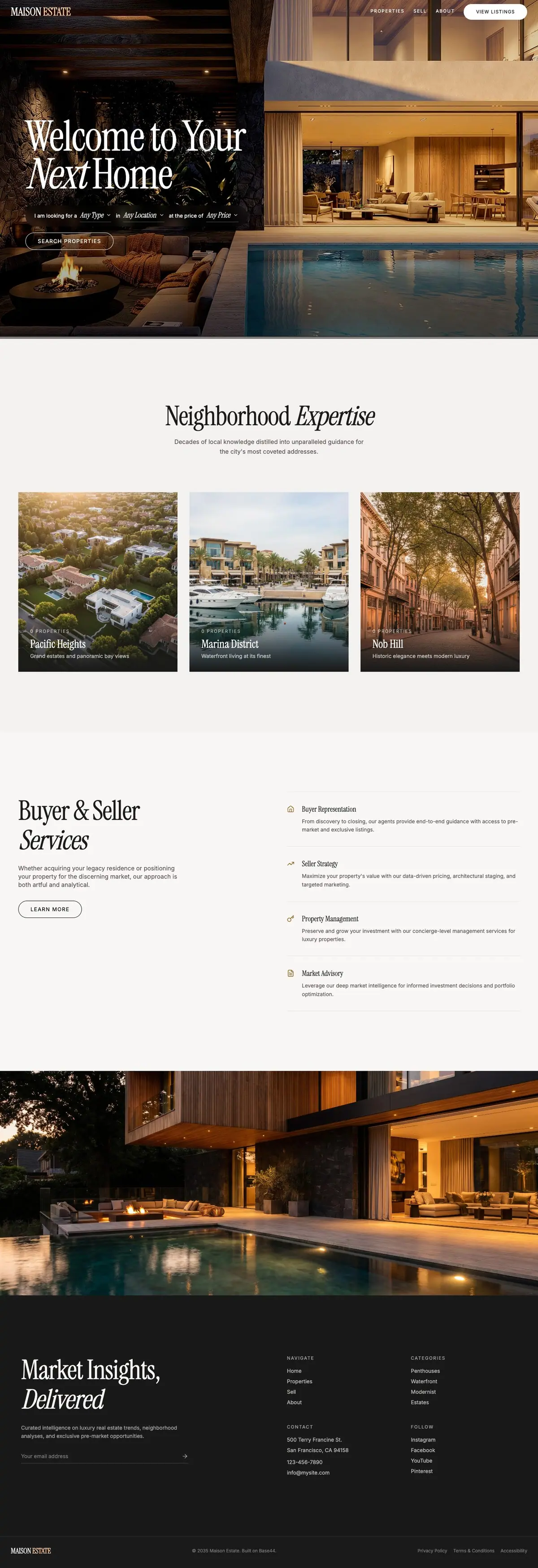
01The opening
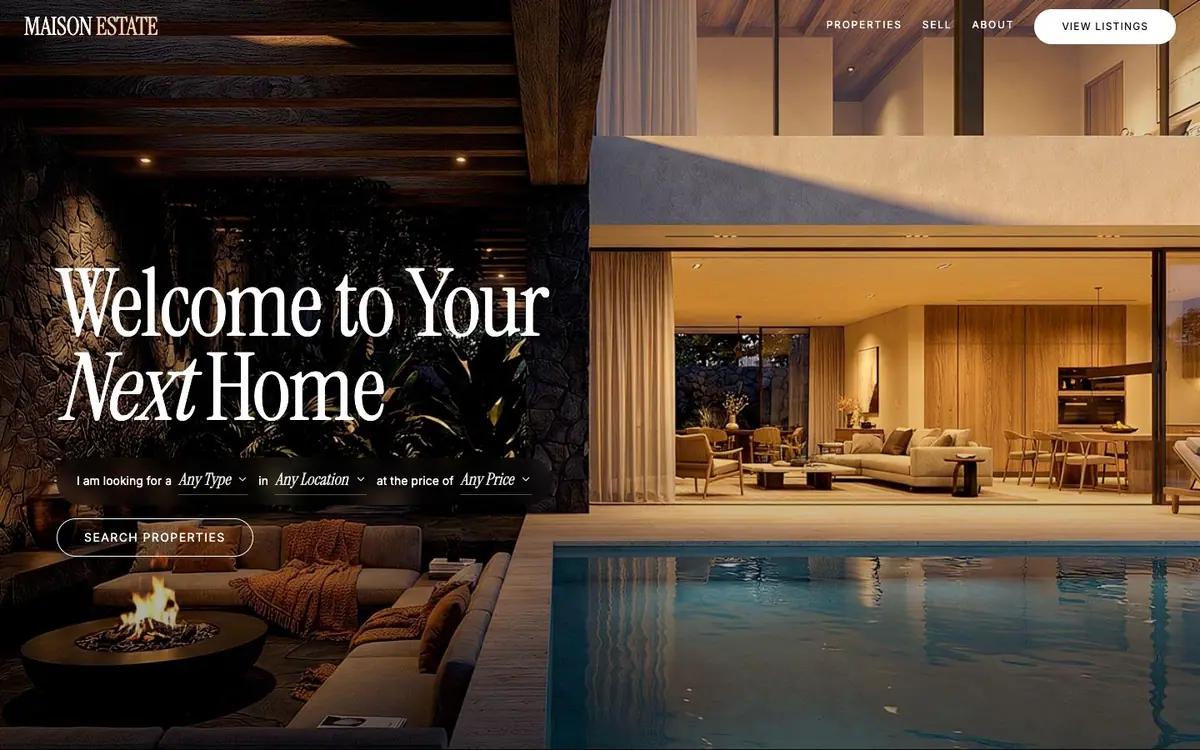
A grid of night interiors with no gaps, and a search written as a line of prose.
The phone stacks into 1.3 times the scroll rather than shrinking the desktop layout.
01The opening
Measured 2026-09-01
The site, read one section at a time. What each one is for, and the one thing the design does there.
01The opening
A grid of night interiors with no gaps, and a search written as a line of prose.
02Neighbourhoods
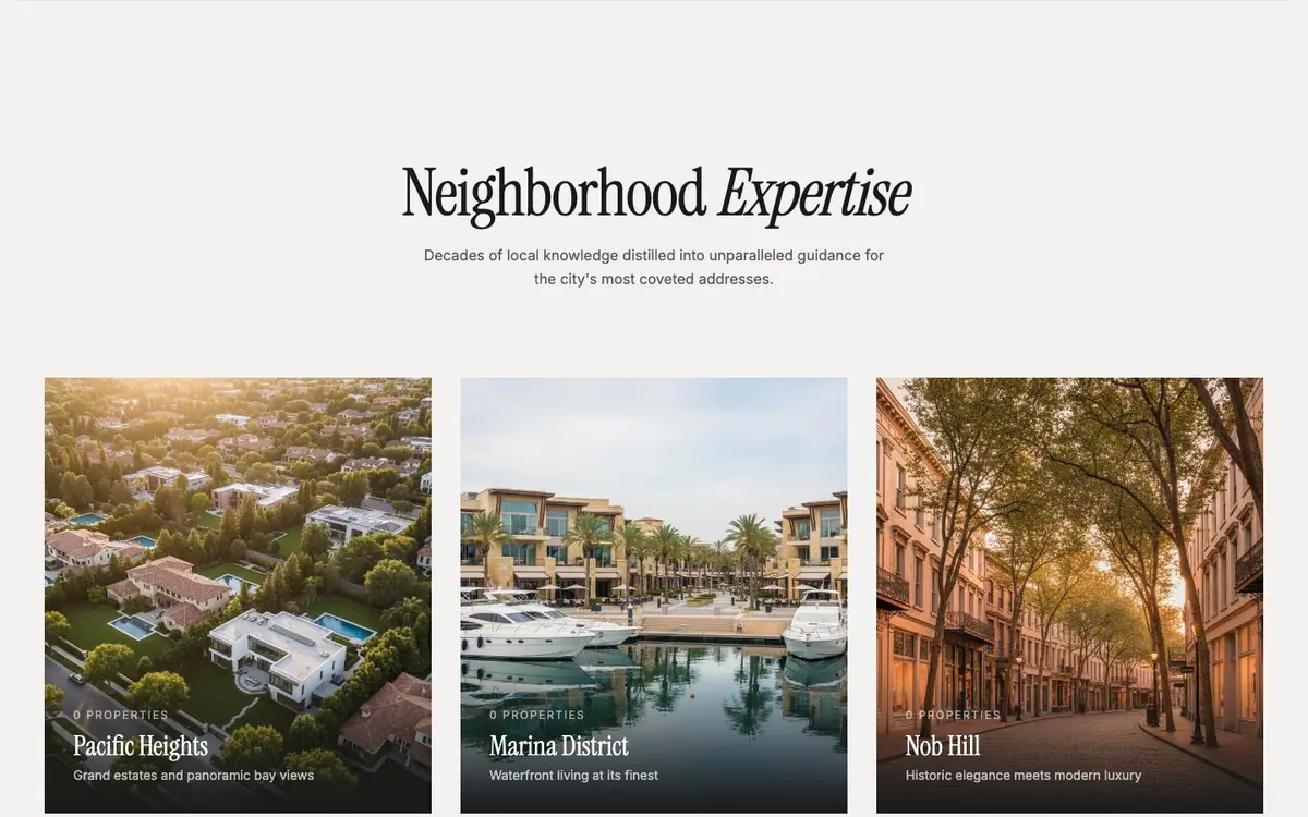
Paper, the first break from photography: three cards, the middle one sitting higher than the others.
03Services

The pitch left, and right four rows of icon, title and two lines, separated by hairlines.
04The house at night
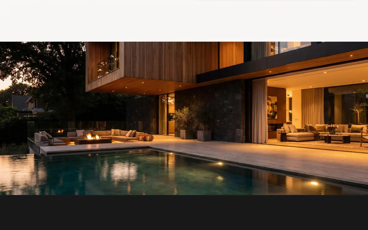
One photograph, full width, no type and no caption. A whole screen to change the subject.
05Market insights and footer
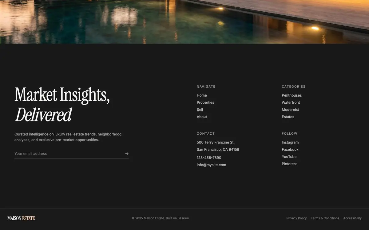
The ground turns near black for an email field with an arrow and three link columns.
Every colour was read off the rendered page and weighted by the area it paints. Photographs are not in it.
The same page at 1440, 834 and 390 pixels wide, drawn at one scale so the phone really is this much narrower.