01The opening
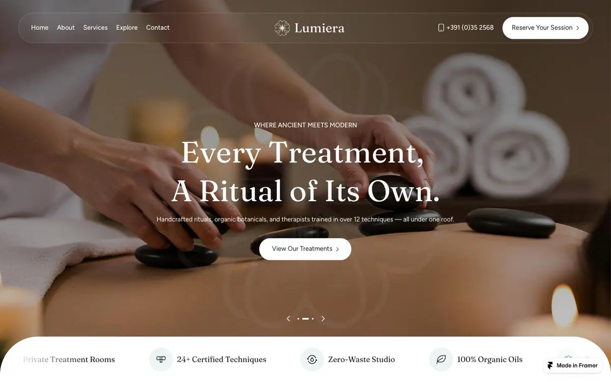
Towels, candles and stones, a rounded floating nav, and four icon claims on a white bar.
The phone stacks into 1.7 times the scroll rather than shrinking the desktop layout.
01The opening
Measured 2026-09-01
The site, read one section at a time. What each one is for, and the one thing the design does there.
01The opening
Towels, candles and stones, a rounded floating nav, and four icon claims on a white bar.
02Treatments
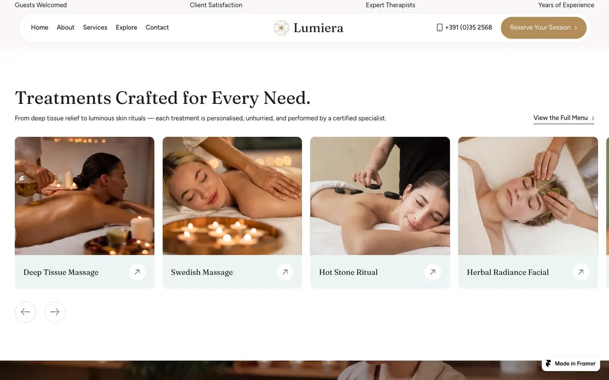
Four cards in a row, a photograph, a name and an arrow. No price on any.
03Massage therapies

A face during treatment, full width, with the heading over it and four pills underneath.
04The price list, and a guest's words
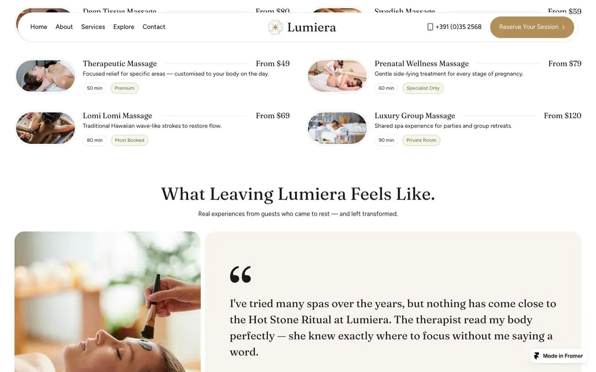
Rows of thumbnail, name, duration and a From price, then one quote with a large quotation mark.
05Press and therapists
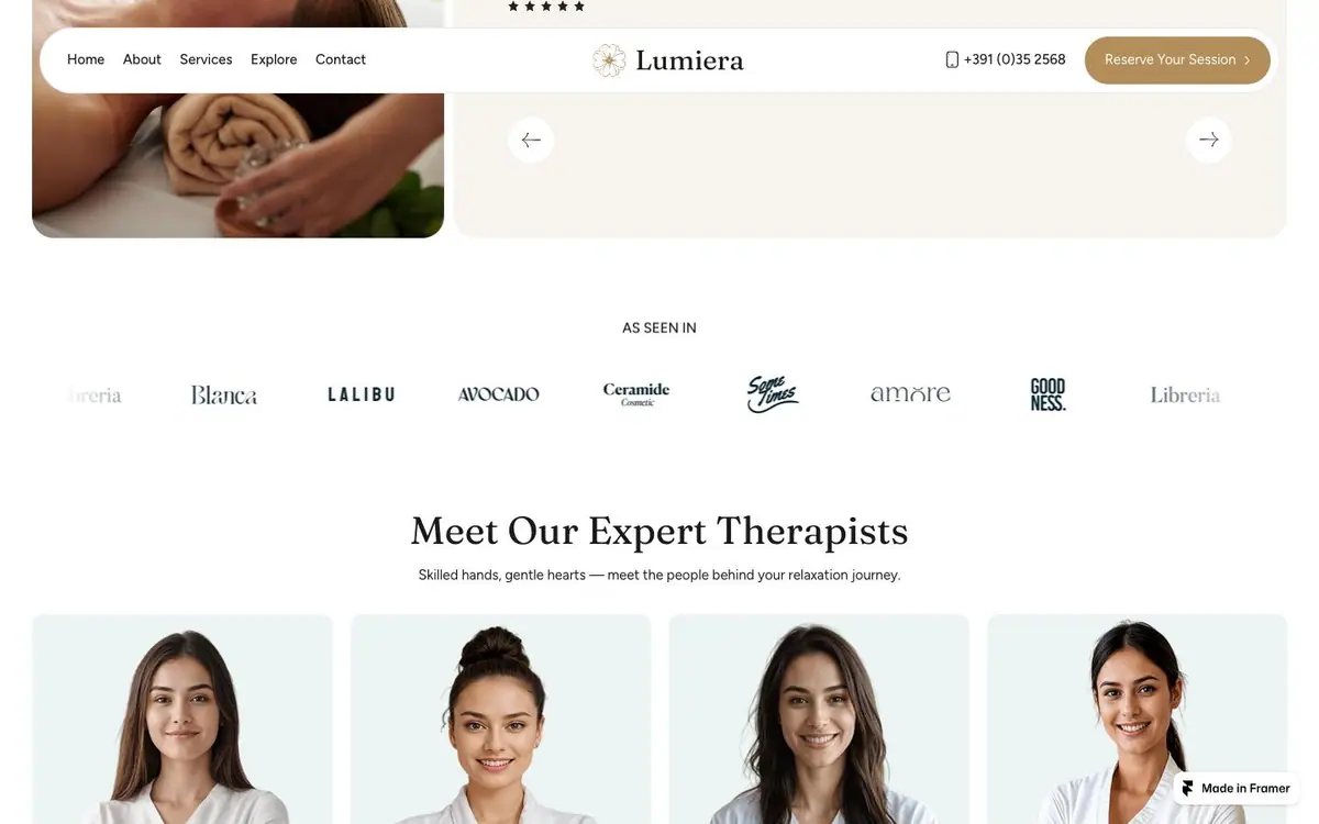
Eight grey wordmarks under an As seen in label, then four portraits on pale blue.
06Newsletter and footer
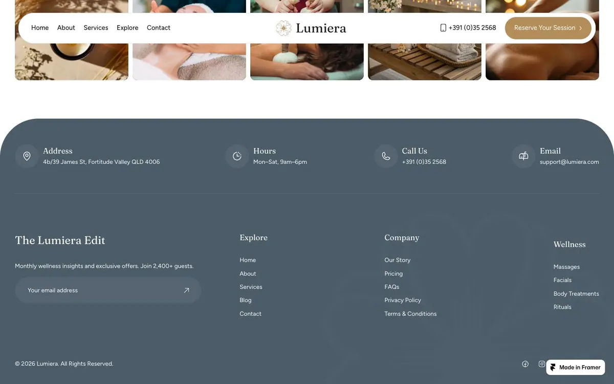
A dark blue band of four contact blocks, then the newsletter field and three link columns.
Every colour was read off the rendered page and weighted by the area it paints. Photographs are not in it.
The same page at 1440, 834 and 390 pixels wide, drawn at one scale so the phone really is this much narrower.


